Building a Custom Mega Menu with an SPFx Application Customizer
SharePoint's own mega menu works, but it's greedy with space both vertically and horizontally, and there's very little you can do to tighten it up or bring it in line with a brand. Styling options equal nearly zero. On an Intranet where styling matter, it can look a little average. This project replaces the out-of-the-box version with a custom mega menu built as an SPFx Application Customizer, one that takes up as little or as much room as you want, looks exactly how you want, and lets you cap the navigation depth deliberately rather than accepting whatever the native control does.
Note: This page assumes familiarity with the SharePoint Framework toolchain and a working local dev setup.
The Requirement
Three things drove this:
- Space. The native mega menu is visually heavy. A custom bar can be a single slim row. logo and links and done, reclaiming some of the space the OOTB wastes.
- Style. The native menu inherits theme colours. There's no supported way to genuinely restyle its layout, spacing, or structure. A custom menu is your own markup in your own DOM element, so it can include corporate brand colours, custom typography, a completely bespoke flyout design, icons etc.
- Control over depth. The number of navigation levels becomes a deliberate choice rather than a platform default. This build caps at three, but you decide
Why an Application Customizer
This is the key architectural point. A mega menu isn't something an editor drags onto one page, it needs to appear on every page of a site, automatically, as part of the chrome. That's exactly what an Application Customizer is for. Unlike a web part, which lives inside a single page's canvas, an Application Customizer is a client-side extension associated with the site itself. Once deployed, it runs on every page load, with no per-page placement.
It renders through a placeholder, which is a named injection point SharePoint exposes on every modern page. There are two, Top and Bottom. The customizer requests the Top placeholder in its onInit, and if it's available, SharePoint hands back a DOM element sitting at the very top of the page. From there it's a standard React mount into that element, just hosted in the page's top slot rather than a web part's root.
The Top placeholder: content rendered into it sits above SharePoint's own navigation, and it pushes the page down slightly rather than overlaying it. For the flyouts of a mega menu's dropdowns need to float over the page on hover, not shove everything below them around every time someone mouses over a top-level item. That's handled in CSS, with the flyouts positioned absolutely and given a high stacking order so they overlay cleanly.
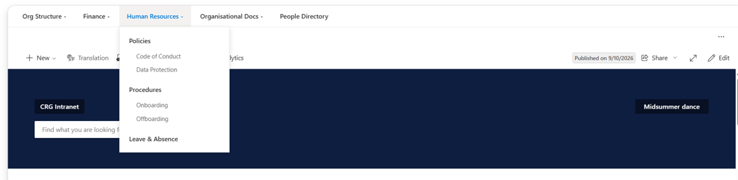
Turning Off the Native Navigation
Injecting a custom bar into the Top placeholder doesn't remove SharePoint's existing navigation. By default you end up with both, which of course defeats the space-saving purpose.
Rather than hiding the native navigation, you can turn it of from site's cog menu, under Change the look → Navigation. The custom mega menu becomes the only navigation on the page./p>
Where the Menu Structure Lives: a SharePoint List
The menu's content doesn't live in code. Hardcoding a navigation structure into the bundle means a rebuild and redeploy every time someone wants to add a link or reorder an item which nable for something a site owner should be able to manage themselves. Instead, the entire structure lives in a single SharePoint list, read at render time, so changing the menu is just editing list items.
A single, self-referencing list handles all three levels. Each row is one menu item, and the hierarchy is expressed by a lookup column pointing back into the same list:
- Title — the label shown in the menu.
- NavUrl — where the link goes. Left blank for a top-level item that only opens a flyout and isn't itself a link.
- Levels — a choice of 1, 2, or 3. Level 1 is the top bar; level 2 is a flyout item; level 3 is a sub-item beneath a level-2 item. This is the field that caps the depth — there simply is no level 4 to choose.
- ParentId — a lookup pointing at another row in the same list. A level-2 item's parent is a level-1 item; a level-3 item's parent is a level-2 item. Blank for a level-1 item, which has no parent.
- SortOrder — controls left-to-right order across the top bar, and top-to-bottom order within a flyout.
- OpenInNewTab — whether the link opens in a new tab.
That "self-referencing" lookup is the whole trick to keeping it a single list: rather than a separate list per level, one list holds every item, and each row simply names its parent from among the other rows. "Products has four children, Resources has two" is expressed naturally./p>
Reading the List into a Tree
At render time, the customizer's React component reads every item from the list in one query,ordered by SortOrder, with the ParentId lookup expanded , and assembles them into a three-level tree in memory. The one detail that catches people out: a lookup column doesn't return a plain value, it returns an object carrying the referenced row's ID. So the parent relationship is resolved on ParentId.Id, not on the field directly. Once the flat rows are turned into a nested structure, the component renders the top level as the bar.
If the list read fails for any reason, the menu falls back to rendering nothing rather than throwing, a broken menu shouldn't be allowed to take a whole page down with it, given it runs on every page load.
Styling: It Can Look Like Anything
This is the real payoff of building rather than configuring. Because the menu is your own markup rendered into a DOM element you fully control, there's no obligation to look like a SharePoint control at all. Every part of it, the bar's height and colour, the typography, the flyout's shadow and spacing, how deeply level-three items indent, hover behaviour, the lot,is plain CSS you own. The example here uses a restrained, near-native look, but that's a choice, not a limit: the same structure could carry a bold branded header, a multi-column flyout layout, icons, or anything else the design calls for.
The End Result
A navigation bar that does exactly what the native mega menu wouldn't and in a fraction of the space, match a brand precisely, cap its own depth by design, and stay entirely under your control, while being managed day to day through a SharePoint list any site owner can edit, with no code change to add a link or reorder a section. It runs on every page as an Application Customizer, reads its structure from a single self-referencing list, and renders into the Top placeholder with the native navigation cleanly switched off beneath it.
Ready to deploy as-is, or fully customisable to match your organisation's brand guidelines. Contact us to discuss your requirements.