Building a News Digest Tool with PnP Modern Search and SPFx
A PnP Modern Search Extensibility Library: Reader-Curated Selection, a Persistent Compose Trigger, and a Multi-Recipient Digest Email
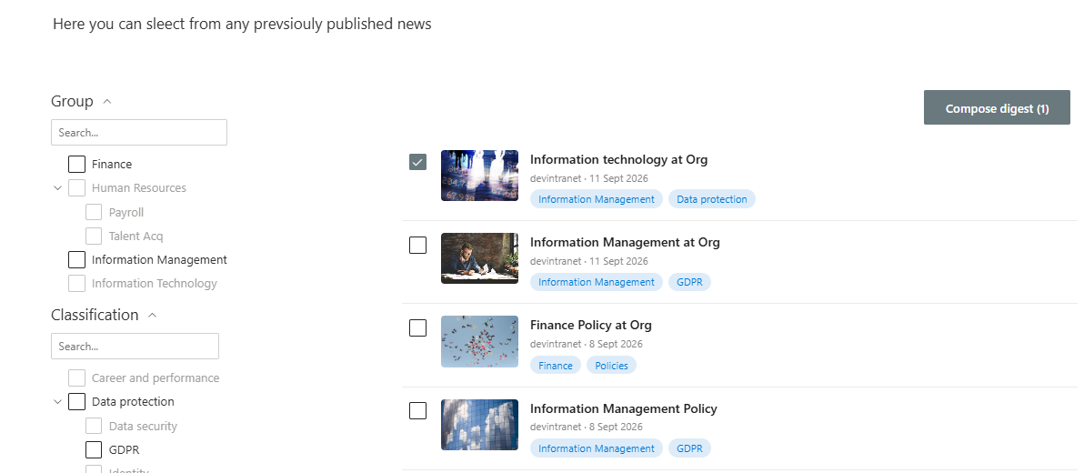
SharePoint's built-in News Digest feature has one job, assemble recent News posts into a single page, and from a list of news articles the user can select items and email them, SharePoint providing an HTML, lightweight version of the news articles to email. This project replaces it with a more flexible and user friendly experience, a rollup of News articles with a checkbox on each one, a running selection that survives as you browse through more results, and a single button that turns whatever you've picked into a proper email, sent to whoever you choose.
It's a third standalone PnP Modern Search extensibility library, following the same architecture as the Featured News and multilingual search card projects before it, its own SPFx solution, its own page, and it reuses several patterns already proven there: the same clickable, locale-aware taxonomy pills, and the same People-Picker-driven email pattern used for sharing an individual article, extended here to a multi-recipient digest.
What This Adds
- A stacked, full-width News rollup, one row per article, with room for a thumbnail, title, metadata, and two taxonomy pills, rather than a cramped grid
- A checkbox on every row that adds or removes that article, title, link, summary, thumbnail, from a shared selection, independent of PnP Modern Search's own built-in selection mechanism
- A persistent "Compose digest" trigger, showing a live count of what's currently selected, that survives paging through more results
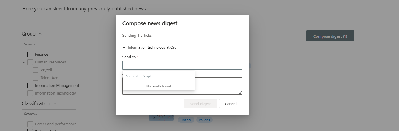
- A compose dialog with a real, multi-recipient People Picker and an optional intro note
- A properly formatted HTML digest email, not a plain-text list, built from whatever articles were selected, sent via Microsoft Graph
Why Not PnP's Built-In Item Selection
PnP Modern Search's Results web part already ships with an "Allow items selection" toggle. But that mechanism is built for connecting two web parts together: select an item in one Results web part, and use one of its field values to filter a second, separate Results web part elsewhere on the page. It's designed for scenarios like picking a category in one list to filter a related list beside it, not for collecting a collection of full item records (title, summary, thumbnail) to act on outside the page entirely.
Turning that toggle on doesn't give a layout any straightforward way to say "here are the five full articles the user just picked, with all their data, ready to email." So this project builds its own, much simpler mechanism instead, a plain, in-memory selection store, owned entirely by the extensibility library.
A Shared Selection Store
The store is a small module, no SPFx-specific machinery, no external dependency, holding whatever's currently selected as a plain Map, keyed by each article's identity:
export interface IDigestItem {
  id: string;
  title: string;
  link: string;
  summary: string;
  thumbnailUrl: string | undefined;
}

const selectedItems: Map<string, IDigestItem> = new Map();

export function selectItem(item: IDigestItem): void {
  selectedItems.set(item.id, item);
  notify();
}

export function deselectItem(id: string): void {
  if (selectedItems.delete(id)) {
    notify();
  }
}

export function getSelectedItems(): IDigestItem[] {
  return Array.from(selectedItems.values());
}
Because this lives at module scope rather than inside any one component's render cycle, it persists for as long as the page stays loaded, a selection made while looking at page 1 of results is still there after paging to page 2. That's a better fit for "browse a few pages of News, pick out the good ones" than a selection mechanism tied to a single render would have been.
A small subscription mechanism lets other parts of the layout react to changes without needing to re-render the whole card list every time a box is ticked:
export function onSelectionChange(listener: (items: IDigestItem[]) => void): () => void {
  listeners.add(listener);
  return () => listeners.delete(listener);
}The Checkbox
Each row's checkbox is its own lightweight web component. It doesn't need any SharePoint context at all, no PageContext, no Graph client, it just reads its own data attributes and writes straight to the store:
private handleChange = (_event, checked?: boolean): void => {
  this.setState({ checked: !!checked });

  if (checked) {
    selectItem({
      id: this.props.itemId,
      title: this.props.title,
      link: this.props.link,
      summary: this.props.summary,
      thumbnailUrl: this.props.thumbnailUrl
    });
  } else {
    deselectItem(this.props.itemId);
  }
}
Deselecting a checkbox removes the article immediately, there's deliberately no separate "remove" step tucked away inside the compose dialog later. The checkbox is the single source of truth for what's in the digest; if a reader changes their mind while scrolling back through the list, that's reflected instantly.
A Persistent, Live Compose Trigger
A single instance of a second web component, placed once in the template, outside the results loop, in a small toolbar above the list, renders the "Compose digest" action. It subscribes to the store on mount, so its count stays in sync with checkbox clicks happening anywhere else on the page:
public componentDidMount(): void {
  this.unsubscribe = onSelectionChange((items) => {
    this.setState({ selectedCount: items.length });
  });
}
<div class="digest-toolbar">
<digest-compose-trigger-component></digest-compose-trigger-component>
</div>
<div class="digest-list">
{{#each data.items as |item|}}
<!-- one row per article, each with its own checkbox -->
{{/each}}
</div>The button only appears once something's actually selected, there's no point showing a "Compose digest (0)" button sitting idle.
Composing and Sending the Digest
Clicking the trigger opens a dialog with a read-only preview of what's currently selected, a multi-recipient People Picker (the same control used for single-article sharing elsewhere in this series, just without the one-person cap), and an optional intro note.
Sending assembles a real HTML email, not a plain-text list, with each article's thumbnail, title, and summary laid out in a simple table:
const articlesHtml = items.map((item) => `
    <tr>
        <td>${item.thumbnailUrl ? `<img src="${item.thumbnailUrl}" width="120" />` : ''}</td>
        <td>
            <a href="${item.link}">${item.title}</a>
            <p>${item.summary || ''}</p>
        </td>
    </tr>
`).join('');

await client.api('/me/sendMail').post({
    message: {
        subject: `News digest: ${items.length} articles`,
        body: { contentType: 'HTML', content: digestHtml },
        toRecipients: recipients.map((r) => ({ emailAddress: { address: r.email } }))
    }
});Once the email sends successfully, the selection clears, the next digest starts fresh rather than silently carrying over whatever was picked last time.
Filterable Pills, Reused
Each row carries the same two clickable taxonomy pills, Directorate and Category, built with the identical taxonomyFilterQuery Handlebars helper described elsewhere in this series. No new mechanism was needed here; the helper takes a filter name as a parameter, so reusing it for a different managed property on a different layout was a straight copy, not a rebuild.
The End Result
A News rollup a reader actually curates, rather than one SharePoint assembles for them. The genuinely new piece here, the in-memory selection store and its live-updating trigger, is a small, self-contained mechanism, deliberately built to route around a native feature that looked like the right fit but was actually solving a different problem. Everything else, the People Picker, the Graph send, the clickable pills, is the same handful of proven patterns from earlier in this series, doing real work again with no changes beyond what the new use case actually needed.
Related Reading
- Building a Featured News Layout with PnP Modern Search and SPFx, the People-Picker share flow this project extends into a multi-recipient digest
- Multilingual Custom Search Page, Part 4, the extensibility library architecture and clickable taxonomy filter pill reused here