Building a Multilingual Custom Search Page with PnP Modern Search
Part 4 — PnP Modern Search Extensibility Library: Custom Layouts, Translation Drift, and Content Ownership
Part 1 covered the information architecture and prerequisites. Part 2 covered building the search page and card templates. Part 3 covered multilingual taxonomy tag resolution using RefinableString111 and the {{AutoRefinableString111}} helper. At the end of Part 3, the search page displayed correctly localised results with working filter labels and card pills.
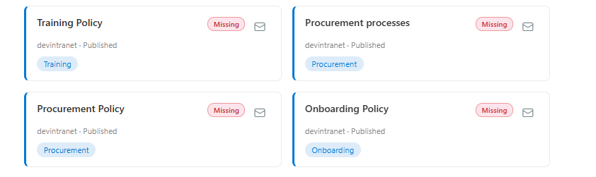
This part goes a step further. Rather than treating the Results web part's built-in layouts and inline Handlebars templates as the extent of what a card can do, I use a PnP Modern Search extensibility library — a separate SPFx project that registers a fully custom layout, a custom web component, and a set of custom Handlebars helpers. The result is a card that does more than present a search result: it surfaces live governance data from a list, implements PnP tag filtering, and gives the user a way to notify the content owner if content is out of date.
The starting point for the extensibility library structure, the layout class shape, the web component wrapper pattern, and the overall project scaffolding, comes from Aimery Thomas's pnp-modern-search-page-status-layout, adapted here for a different data source and a different set of card behaviours.
What This Adds
- A standalone SPFx extensibility library project, deployed independently of the search page itself
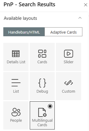
- A custom card layout (Multilingual Cards) registered against the Results web part's layout picker, alongside the built-in layouts
- Two switchable options in the layout's own property pane, so an editor can turn each feature on or off per web part instance without touching code
- A live translation-drift badge on each card, sourced from a separate governance list rather than recomputed on every page load
- A clickable tag pill that pre-applies a filter on the page, using PnP Modern Search's built-in filter-deep-linking mechanism
- A "contact page owner" button, backed by a real web component with its own React UI, that emails a page's designated ContentOwner
Why an Extensibility Library, Not Just a Linked HTML File
Everything in Part 3 lived inside the Results web part's own configuration, an inline Handlebars template, edited directly in the property pane's "Edit results template" field. That approach can only reference Handlebars' built-in helpers, plain field values, and whatever markup you paste in. It has no way to register a new helper function, no way to embed a real, stateful UI component (a dialog, a form, anything with its own logic), and no way to package a layout as a reusable, named option that shows up in the layout picker next to Cards, Slider, List, and the rest.
A PnP Modern Search extensibility library solves all three. It's a separate SPFx project with its own .sppkg, deployed and activated independently of the search page that implements the IExtensibilityLibrary interface from @pnp/modern-search-extensibility. Once deployed and enabled on the Results web part's "Extensibility library" configuration, it can contribute:
- Custom layouts — new entries in the layout picker, each backed by its own Handlebars template and its own property pane fields
- Custom web components — React components wrapped as native Custom Elements, embeddable directly inside a Handlebars template via a plain HTML tag
- Custom Handlebars helpers — new functions available to any template on the page, not just the ones this library ships
This is the difference between decorating a result and building a small application inside the result.
Project Structure
The library lives as its own SPFx project (pnp-multilingual-search-layouts in this build), separate from the search page's configuration. The relevant files:
src/libraries/searchCustomLayoutsLibrary/
├── SearchCustomLayoutsLibrary.ts       ← entry point: IExtensibilityLibrary implementation
├── SearchCustomLayoutsLibrary.manifest.json
├── multilingual-cards-layout.html      ← the Handlebars template for the custom layout
└── translationDriftStore.ts            ← shared module: fetches and caches TranslationDrift data

src/libraries/
└── ContactOwnerComponent.tsx           ← the web component + its React UI
Two classes matter in the entry point file:
- SearchCustomLayoutsLibrary — implements IExtensibilityLibrary. This is what SharePoint loads when the library is enabled on a Results web part. It declares what layouts, web components, and Handlebars helpers this library contributes.
- SearchCardsLayout — extends BaseLayout<TProperties>. This is the actual layout: one instance per Results web part that has it selected. It owns the layout's own property pane fields and a lifecycle hook (onInit()) that runs before the template renders.
Registering the Custom Layout
IExtensibilityLibrary.getCustomLayouts() returns an array of layout definitions. Each one needs a display name, an icon, a render type, the Handlebars template content, and a ServiceKey that PnP uses to instantiate and look up the layout class:
getCustomLayouts(): ILayoutDefinition[] {
  return [
    {
      name: 'Multilingual Cards',
      iconName: 'DocumentManagement',
      key: 'MultilingualCardsLayout',
      type: LayoutType.Results,
      renderType: LayoutRenderType.Handlebars,
      templateContent: require('./multilingual-cards-layout.html').default.toString(),
      serviceKey: SearchCardsLayout.serviceKey
    }
  ];
}export class SearchCardsLayout extends BaseLayout<ISearchCardsLayoutProperties> {
public static readonly serviceKey: ServiceKey<SearchCardsLayout> =
ServiceKey.create<SearchCardsLayout>('SearchCardsLayout', SearchCardsLayout);
// ...
}getCustomLayouts() then references SearchCardsLayout.serviceKey rather than calling ServiceKey.create() itself.
Switchable Properties on the Custom Layout
One of the advantages of a real layout class over an inline template is that it gets its own property pane fields, defined via getPropertyPaneFieldsConfiguration(). This build exposes two independent toggles, so a site owner can enable either feature per web part instance without redeploying anything:
export interface ISearchCardsLayoutProperties {
  showTranslationDriftFlag: boolean;
  showContactOwnerButton: boolean;
}

public getPropertyPaneFieldsConfiguration(): IPropertyPaneField<unknown>[] {
  return [
    PropertyPaneCheckbox('layoutProperties.showTranslationDriftFlag', {
      text: 'Show translation drift flag',
      checked: true
    }),
    PropertyPaneCheckbox('layoutProperties.showContactOwnerButton', {
      text: 'Show contact owner action for outdated content',
      checked: true
    })
  ];
}
These surface automatically under "Layout options" in the Results web part's property pane, alongside the built-in Common/Styling/Title sections every layout gets for free. The template reads them via @root.properties.layoutProperties.*, which means either feature can be switched off entirely, for a site that doesn't run translation drift scanning, or a page where content ownership isn't tracked, with no code change.
A Web Component Inside a Handlebars Template
Handlebars templates are static markup with data interpolation, they have no concept of component state, event handlers, or asynchronous data loading of their own. For anything that needs real interactivity, a dialog, a form, a loading state, the pattern is to register a Custom Element via getCustomWebComponents(), and simply drop its tag into the Handlebars template like any other HTML element.
public getCustomWebComponents(): IComponentDefinition<unknown>[] {
  return [
    {
      componentName: 'contact-owner-component',
      componentClass: ContactOwnerWebComponent
    }
  ];
}
ContactOwnerWebComponent extends BaseWebComponent from the extensibility library, and its connectedCallback() mounts a real React component (ContactOwnerComponent) into itself via ReactDOM.render():
export class ContactOwnerWebComponent extends BaseWebComponent {
  private _pageContext: PageContext | undefined;
  private _graphClientFactory: MSGraphClientFactory | undefined;

  public async connectedCallback(): Promise<void> {
    const props = this.resolveAttributes();
    const serviceScope: ServiceScope = this._serviceScope;
    serviceScope.whenFinished(() => {
      this._pageContext = serviceScope.consume(PageContext.serviceKey);
      this._graphClientFactory = serviceScope.consume(MSGraphClientFactory.serviceKey);
    });
    const component = <ContactOwnerComponent
      context={this._pageContext as PageContext}
      graphClientFactory={this._graphClientFactory as MSGraphClientFactory}
      {...props} />;
    ReactDOM.render(component, this);
  }

  protected onDispose(): void {
    ReactDOM.unmountComponentAtNode(this);
  }
}
resolveAttributes() picks up every data-* attribute on the tag and passes it through as a React prop, which is how per-item data (page URL, title, list item ID) gets from the Handlebars template into the component:
<contact-owner-component
    data-item-id="{{item.ListItemID}}"
    data-page-url="{{item.Path}}"
    data-site-url="{{item.SPSiteURL}}"
    data-web-url="{{item.SPWebUrl}}"
    data-title="{{item.Title}}">
</contact-owner-component>The React component itself (ContactOwnerComponent) is a self-contained piece of UI: a mail icon button that, on click, looks up the page's ContentOwner field (a Person/Group column) via PnP JS, opens a Fluent UI dialog showing the owner's name and email, and on confirmation sends a plain-text email via Microsoft Graph's /me/sendMail endpoint, with an optional free-text note from the person raising the flag.
const item = await list.items.getById(parseInt(itemId, 10))
    .select("ContentOwner/Title", "ContentOwner/EMail")
    .expand("ContentOwner")();

this.setState({
    ownerName: item.ContentOwner?.Title || undefined,
    ownerEmail: item.ContentOwner?.EMail || undefined,
    isLoadingOwner: false
});
This deliberately doesn't write anything anywhere. There is no log list and no status tracking. The email fires, and that's the whole feature. Flagging a page as possibly outdated is a subjective, low-stakes action; it doesn't need a governance trail, just a fast way to get the right person's attention.
Custom Handlebars Helpers
The third thing an extensibility library can contribute is new Handlebars helper functions, registered via registerHandlebarsCustomizations(). This is where the translation-drift badge and the clickable filter pill both get their logic.
Handlebars' subexpression syntax ({{#if (someHelper arg)}}) isn't reliably supported across every PnP Modern Search Handlebars runtime version, so this build favours block helpers — a single helper that implements its own if/else branching internally, which behaves identically to Handlebars' native {{#if}}:
handlebarsNamespace.registerHelper('ifDrift', function (
  this: unknown,
  pageGuid: string,
  options: Handlebars.HelperOptions
) {
  const record = getDriftRecord(pageGuid);
  if (record && record.driftStatus !== 'In Sync') {
    return options.fn(this);
  }
  return options.inverse(this);
});
Used in the template exactly like a built-in conditional:
{{#ifDrift item.UniqueID}}
  <span class="drift-badge">...</span>
{{else}}
  {{! nothing — page has no drift issue }}
{{/ifDrift}}
Alongside it, three small formatting helpers turn a raw drift record into the pieces the badge needs — a CSS class, a compact label, and a tooltip string:
handlebarsNamespace.registerHelper('driftStatusClass', (pageGuid: string) => {
  const record = getDriftRecord(pageGuid);
  return record ? record.driftStatus.toLowerCase().replace(/\s+/g, '') : '';
});

handlebarsNamespace.registerHelper('driftBadgeLabel', (pageGuid: string) => {
  const record = getDriftRecord(pageGuid);
  if (!record) return '';
  return record.daysDrift > 0
    ? `${record.driftStatus} · ${record.daysDrift}d`
    : record.driftStatus;
});Reading Translation Drift Live, Without Recomputing It
The translation-drift badge needs to know, per card, whether that page's translation is stale, missing, orphaned, or abandoned — and how many days behind, where applicable. There were two ways to get that data at render time.
The Rejected Approach: Recompute Drift Live, Per Page Load
The scanning logic that determines drift status and reading every page in the Site Pages library, matching English source pages to French translations via _SPTranslationSourceItemId against UniqueId, and comparing Modified dates — already exists in a separate governance app. It would be possible to run that same logic inside the layout's onInit(), on every single page load of the search results.
This was deliberately rejected on performance grounds. Search results are typically a handful of items per page, but determining drift for even one of them via live computation means reading the entire Site Pages library (thousands of items on a mature site) and performing the source/translation matching in memory, on every visitor's page load, in addition to the search query that already ran to produce the results. That's a fundamentally different order of cost than reading a handful of already-computed rows from a small, dedicated list. Translation drift is also inherently a slow-moving signal — a page doesn't go from fresh to stale between one page load and the next — so there's no real freshness benefit to paying that cost live.
The Chosen Approach: Read a Pre-Computed Cache, Once Per Page Load
The governance app's scan already writes its results — PageGuid, DriftStatus, DaysDrift — to a TranslationDrift list, on whatever schedule an administrator runs it. The layout's job at render time is simply to read that list, once, and hold the result in memory for the duration of the page load:
export async function loadTranslationDrift(serviceScope: any, listName: string): Promise<void> {
  if (loaded) return;

  const pageContext: PageContext = serviceScope.consume(PageContext.serviceKey);
  const webUrl = pageContext.web.absoluteUrl;

  const response = await fetch(
    `${webUrl}/_api/web/lists/getbytitle('${listName}')/items?$select=PageGuid,DriftStatus,DaysDrift&$top=5000`,
    { headers: { accept: 'application/json;odata=nometadata' }, credentials: 'same-origin' }
  );

  const json = await response.json();
  for (const item of json.value) {
    driftMap.set(normalizeGuid(item.PageGuid), {
      driftStatus: item.DriftStatus,
      daysDrift: item.DaysDrift
    });
  }
  loaded = true;
}
This runs from SearchCardsLayout.onInit() — a lifecycle hook BaseLayout exposes specifically for this purpose, which PnP Modern Search awaits before rendering the template:
public async onInit(): Promise<void> {
  await loadTranslationDrift(this.serviceScope, 'TranslationDrift');
}
Once loaded, getDriftRecord(pageGuid) is a synchronous, in-memory lookup — safe to call from a Handlebars helper, which has no way to await anything mid-render. The matching key is the page's own GUID: PageGuid in the list (bare, no braces) against UniqueID from the search result (braces-wrapped), normalised on both sides before comparison.
One further limitation worth noting: because the governance app currently keys each drift record only by the English source page's GUID, the badge only appears on the English half of a translation pair — the French translation page itself has no matching row in the list. Extending the list schema with a second TranslationPageGuid column, populated from the translation page's own UniqueId, resolves this by letting either page's GUID resolve to the same drift record.
The Clickable Filter Pill
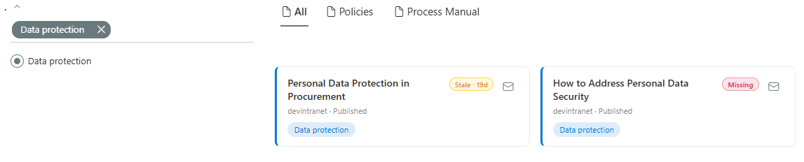
Part 3 established {{AutoRefinableString111}} as the way to render a locale-correct taxonomy label on the card. This part turns that same pill into a working filter control — clicking "Data protection" reloads the page with the Filters web part's "Data protection" checkbox pre-selected, using PnP Modern Search's own built-in filter-deep-linking mechanism (available from PnP Modern Search 4.22.0 onward, via the stringToHex Handlebars helper for plain-text refiners).
The template builds the pill as a plain anchor tag, using the locale-aware AutoRefinableString111 for the visible label but the raw RefinableString111 value for the encoded filter target — since the filter match happens against the underlying term reference, not the display text:
{{#if item.AutoRefinableString111}}
<a href="?f_{{@root.filters.instanceId}}={{taxonomyFilterQuery item.RefinableString111 item.AutoRefinableString111 'RefinableString111'}}"
   class="search-card-pill"
   title="Filter by {{item.AutoRefinableString111}}">
    {{item.AutoRefinableString111}}
</a>
{{/if}}
@root.filters.instanceId ties the generated URL to the specific Filters web part instance connected to this Results web part on the page, the same identifier the Filters web part reads on page load to restore a shared or bookmarked filtered view.
Bringing It Together
With all of the above registered, a single card in the finished template combines four independent, individually-toggleable behaviours: a title link, a translation-drift badge (Step 7), a contact-owner button (Step 5), and a clickable, locale-aware filter pill (Step 8) — each reading from a different source (the search index, the TranslationDrift list, and the ContentOwner field respectively), none of them aware of the others.
<div class="search-card">
    <div class="search-card-header">
        <h3 class="search-card-title">
            <a href="{{item.Path}}">{{item.Title}}</a>
        </h3>
        <div class="search-card-actions">
            {{#if @root.properties.layoutProperties.showTranslationDriftFlag}}
                {{#ifDrift item.UniqueID}}
                <span class="drift-badge drift-badge--{{driftStatusClass item.UniqueID}}"
                      title="{{driftTooltip item.UniqueID}}">
                    {{driftBadgeLabel item.UniqueID}}
                </span>
                {{/ifDrift}}
            {{/if}}
            {{#if @root.properties.layoutProperties.showContactOwnerButton}}
            <contact-owner-component
                data-item-id="{{item.ListItemID}}"
                data-page-url="{{item.Path}}"
                data-site-url="{{item.SPSiteURL}}"
                data-web-url="{{item.SPWebUrl}}"
                data-title="{{item.Title}}">
            </contact-owner-component>
            {{/if}}
        </div>
    </div>
    <div class="search-card-pills">
        {{#if item.AutoRefinableString111}}
        <a href="?f_{{@root.filters.instanceId}}={{taxonomyFilterQuery item.RefinableString111 item.AutoRefinableString111 'RefinableString111'}}"
           class="search-card-pill">
            {{item.AutoRefinableString111}}
        </a>
        {{/if}}
    </div>
</div>
The End Result
A card that started, in Part 2, as a static presentation of a search result now does three additional, independent things: it surfaces a governance signal computed elsewhere on the site, it lets a visitor narrow the page's results with a single click, and it gives them a direct channel to the person responsible for keeping that content accurate. None of this required touching the search page's own configuration — it lives entirely in a separately-deployed extensibility library, switchable per web part instance, and reusable on any other Results web part on the tenant that wants the same card.
The badge is only as good as the governance app's scan schedule behind it, and the two remain deliberately decoupled: this library reads a list, it doesn't know or care how that list gets populated. That separation is what keeps the card fast — a handful of small REST reads per page load, no recomputation, no dependency on the search results page ever knowing how translation drift is actually calculated.
Related Reading
- Building a Translation Governance Dashboard — the scanning app that populates the TranslationDrift list this card reads from
- Create Multilingual Term Store — Provision term groups, term sets, and terms with per-locale translated labels from a JSON configuration file