Building a Multilingual Custom Search Page with PnP Modern Search
Part 2 — Verticals, Filters, and Card Templates
Part 1 of this series covered the information architecture and prerequisites for a multilingual PnP Modern Search implementation. This part covers the actual build — adding and configuring the web parts, connecting them together, scoping results by content type, and building the card templates that control how results are displayed.
The Web Parts
A custom PnP Modern Search page is built from a small set of web parts that work together:
- PnP — Search Verticals — the tab-style navigation across different result scopes (All, Policies, Process Manual, and so on)
- PnP — Search Filters — the left-hand refiner panel (function, document type, and so on)
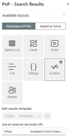
- PnP — Search Results — the main results panel where your card templates render
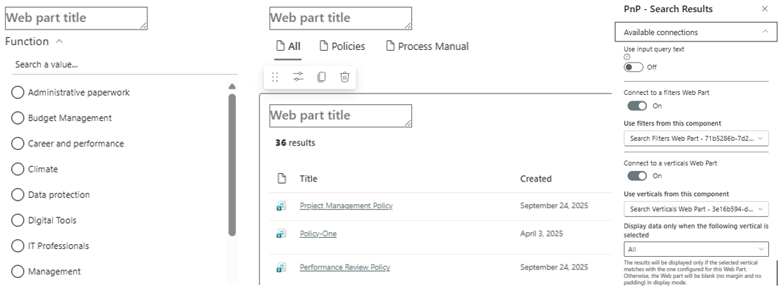
These three web parts need to be connected to each other so that selecting a vertical or filter actually changes what the results web part displays.
Adding and Connecting the Web Parts
Add all three web parts to the page in the layout you want — typically verticals across the top, filters down the left, results in the main column.
Connecting Filters to Results
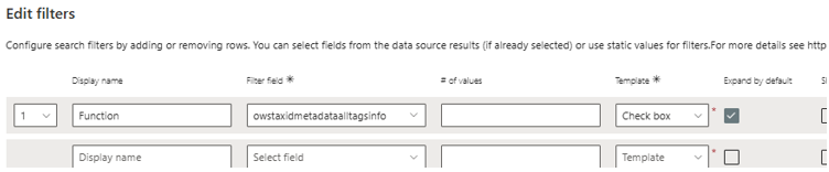
Edit the Search Results web part, go to the connections configuration, and select your Search Filters web part as the data source. This ensures that when a user selects a filter value, the results web part receives the refinement and updates.
Connecting Verticals to Results
Same pattern — the Search Results web part needs to receive its query context from the Search Verticals web part so that switching tabs changes the scope of results shown.
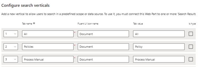
Configuring Verticals
Each vertical needs its own query template that scopes results to particular content types. For an "All", "Policies", and "Process Manual" setup, you'd configure three verticals.
Scoping by Content Type
The two options are ContentType (the display name) or ContentTypeId (the permanent identifier). ContentTypeId is the more stable choice — content type display names can be renamed by an editor without anyone realising the search scope will silently break, whereas the ID never changes.
To find a content type's ID, open the list or library settings, click into the content type, and the ID appears in the URL as ctype=0x.... Or retrieve it via PnP PowerShell:
Get-PnPContentType -List "Site Pages" | Select-Object Name, IdThe query template for a vertical scoped to Policy content uses a wildcard match on the ID, which also captures any content types that inherit from it:
ContentTypeId:0x0101009D1CB255DA76424F860D91F20E6C41180071*In this case the All vertical includes all content types in the query template. The base template will be applied to the most generic. Other cards will highlight certain content types.
Configuring the Filters Web Part
Each filter maps to a managed property — for example, Function maps to RefinableString00 in our setup. The checkbox filter template has consistently switched labels correctly when ?Locale=fr-FR is appended to the URL, in our testing.
Slots — and Why You May Not Need Them
PnP Modern Search pre-configures a set of standard slots out of the box — Title, Path, FileType, and a handful of others. If your card template only needs these standard fields, you don't need to configure any custom slot mapping at all. Reference them directly in your Handlebars template as {{slot item @root.slots.Title}} and so on.
Slot mapping only becomes necessary if you want to expose additional managed properties — like your RefinableString columns — through the slot system specifically. In this build, we didn't use them at all. Instead, the RefinableString value is referenced directly in the Handlebars template:
{{#each (split (slot item @root.slots.Tags) ";") limit=2}}
    <span class="card-pill">{{trim (last (split this "|"))}}</span>
{{/each}}
This is a simpler approach for a custom card template where you're writing the Handlebars yourself rather than relying on the out-of-the-box card designer.
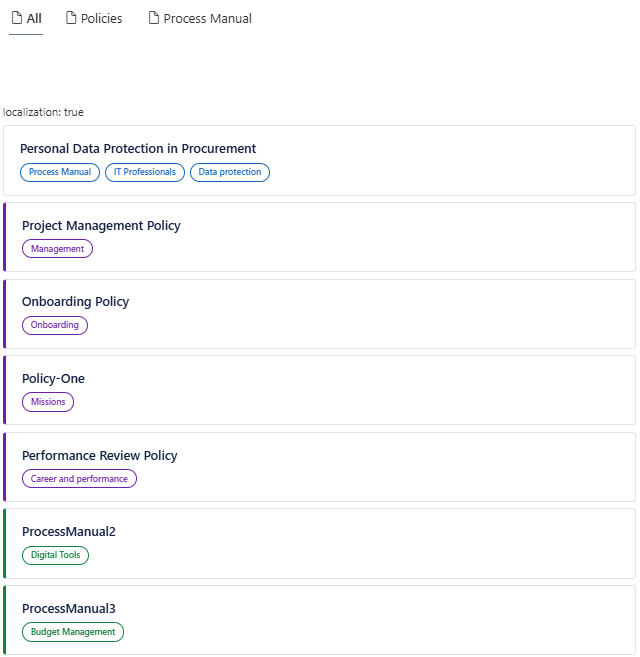
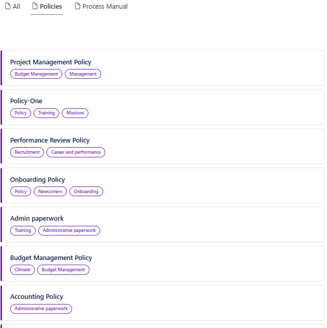
The Card Templates
Three card templates were built for this implementation, each visually distinguishing a different content type:
| Template | Used For | Visual Treatment |
|---|---|---|
| Base | The "All" vertical and any content type without a dedicated visual treatment | White card, blue pill |
| Policy | Policy content | Purple left border |
| Process Manual | Process manual content | Green left border |
The Policy and Process Manual templates use a coloured left border rather than a different layout — this keeps visual consistency across the result set while still making content type identifiable at a glance.
Title Wrapping
By default, card titles may not wrap correctly if the underlying CSS doesn't account for longer titles. The fix is straightforward — ensure the title element allows normal text wrapping rather than truncating or overflowing:
.card-title {
    white-space: normal;
    overflow: visible;
    word-break: break-word;
}
Adding a Summary/Description
To surface a short description beneath the title, map a Summary slot to the AutoSummary or Description-mapped managed property in the data source properties, then reference it in the template with a clamp to limit it to a fixed number of lines:
{{#if (slot item @root.slots.Summary)}}
<div class="card-summary">
    {{slot item @root.slots.Summary}}
</div>
{{/if}}
.card-summary {
display: -webkit-box;
-webkit-line-clamp: 2;
-webkit-box-orient: vertical;
overflow: hidden;
word-break: break-word;
}Tag Pills
The pill display logic splits a semicolon-delimited multi-value managed property, takes a limited number of values, and extracts just the label portion (discarding any GUID or path prefix that the raw value might carry):
<div class="card-pills">
    {{#each (split (slot item @root.slots.Tags) ";") limit=2}}
        <span class="card-pill">{{trim (last (split this "|"))}}</span>
    {{/each}}
</div>
Result Types and Inline Snippets
Within the "All" vertical, result types allow different card templates to render automatically based on the content type of each individual result — so a Policy item shows the purple-bordered card and a Process Manual item shows the green-bordered card, all within the same mixed result list.
Choose Custom as the card type, then add a link to the base card template — these are normally stored in Site Assets.
This is configured via the resultTypes Handlebars helper wrapping the card markup, with the result type rules defined separately in the web part's result types configuration, matched by content type or another managed property condition.
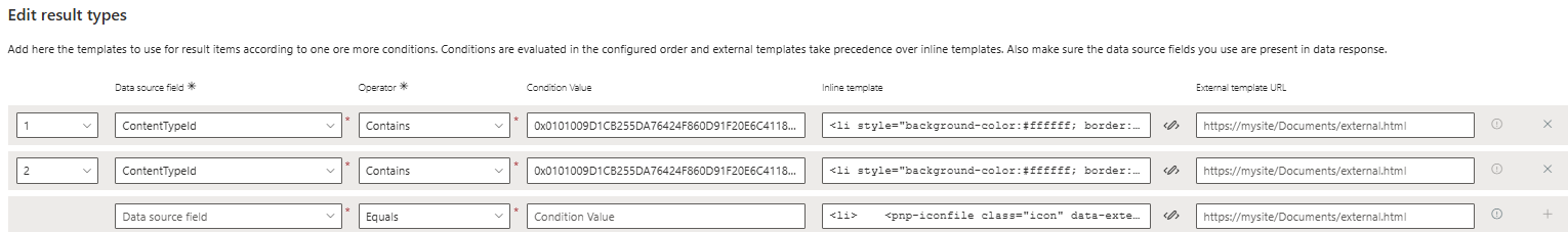
{{#> resultTypes item=item}}
    <li>
        <!-- card markup -->
    </li>
{{/resultTypes}}
Connecting the Page to Site Search
Building the page is only half the job — SharePoint needs to be told to actually use it when someone searches from the standard search box anywhere on the site, rather than only working when visited directly.
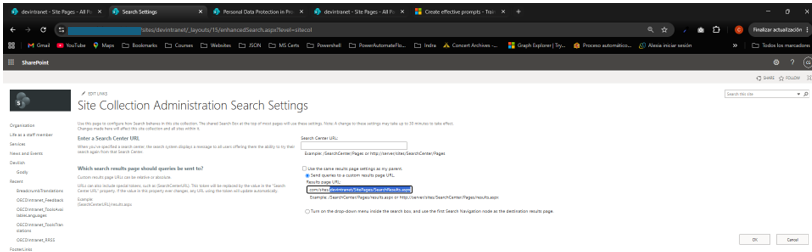
Setting the Custom Search Results Page
Go to Site Settings → Search Settings (for a single site) or Site Collection Settings → Search Settings (to apply it across the whole site collection). Under "Configure search results page settings," enter the URL of your custom search page for both:
- Site Search Results Page — controls search initiated from this specific site
- Site Collection Search Results Page — controls search initiated from anywhere in the site collection, including the megamenu or header search box
Updating the Query Text to Read from the Page Environment
By default, a newly added Search Results web part only responds to its own on-page search box, ignoring whatever was typed into the header search box that redirected the user there in the first place. To fix this, the web part's query text needs to read from the URL query string parameter that SharePoint passes through on redirect.
What's Covered Here vs What Comes Next
Everything in this page uses the current, working approach:
- Direct managed property references in the Handlebars template rather than custom slot mappings
- Checkbox filters for reliability
- ContentTypeId for stable content-type scoping
This is a fully functional custom search experience as it stands.
What it does not yet cover is the multilingual tag resolution — getting the ows_taxId_ crawled properties to correctly populate their mapped RefinableString managed properties so that filter pills display translated labels rather than the default English value. That diagnostic process, and the eventual move to managed card fields once the search schema mapping is resolved, is covered in Part 3.
Related Scripts
- Add Navigation Translations — Add multilingual translations to SharePoint navigation nodes via PnP PowerShell
- Create Bilingual Navigation — Build a complete EN/FR Quick Launch navigation from a JSON configuration file
- Create Translations of Pages in Folder — Bulk create French translation pages for existing pages in a folder
- Create Term Store — Script a Term Store term group and term sets from scratch
- Create Multilingual Term Store — Provision term groups, term sets, and terms with per-locale translated labels from a JSON configuration file